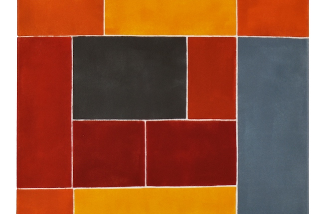
Very often a mathematical and scientific approach to observed reality can give the wrong impression that the work remains cold, aseptic, analytical and therefore devoid of concept or emotion. However this thesis belonging to the last century has been overcome by the ability to combine form with the existential concept that characterises contemporary artists. Today’s protagonist belongs to that category of creatives for whom analysis and geometricity are not detached from emotion, but rather become its amplifiers.
The beginning of the twentieth century was characterised by a succession of pictorial movements that had as their common denominator the need to break with the previous academic rules in order to adapt art to the innovative and dynamic winds of change that arrived and lasted throughout the mid-twentieth century. Especially during the First World War, the emotions of the artists were destabilised by the ugliness and atrocities of the conflict, to the point of making it more complicated to stick to the perfection of a form that now seemed out of time, anachronistic precisely because of the events; to this must be added the need of a large group of creative artists to support and emphasise the supremacy of the pictorial gesture over the new photographic technology that was emerging. The first artist to choose geometricity and purity of the creative act, detachment from the figuration of observed reality and primary colours to describe the plasticity of his works was Kazimir Malevič who, with his Suprematism, paved the way and founded the guidelines that were taken up a few years later by the Dutch De Stijl movement, also known as Neoplasticism. The rigour of the geometric shapes of the square and the rectangle, the obstinate adherence to the choice of only primary colours – yellow, blue, red, white and black – however, relegated the artworks of Piet Mondrian and Theo van Doesburg to an intellectual and restricted public that appreciated their scientific nature and lack of emotional vibrations, characteristics that prevented them from being appreciated by a wider public. In the rest of Europe, however, Geometric Abstraction spread and opened up to different interpretations, both from the point of view of the chromatic range and from the point of view of the shapes included in the artworks, from the circle to the parallelepiped, from the prism to the triangle, giving the movement a wider diffusion and easier appeal to the viewer. The Greek artist Kleopatra Moursela draws on the origins of Geometric Abstraction, but gives it a very personal touch by infusing her artworks with a subtle concept that cannot fail to emerge, prompting the observer to question about the essence of existence.
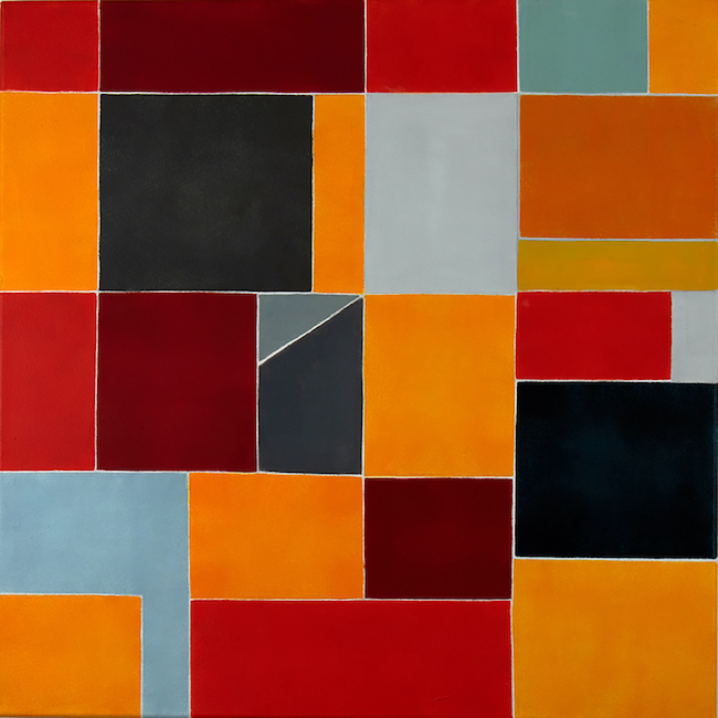
The colours chosen are predominantly warm, breaking away from the rigidity of primary colours, and are presented in different shades and intensities; the same geometric shapes are alternated and intersected one with the other as if to form a universe that is different but at the same time closely connected, and which only through closeness and dialogue can have, and give, an overall vision that is far more fascinating and involving than the individual.
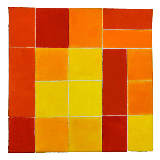
Kleopatra Moursela‘s canvases seem to be metaphors of contemporary life, that openness to globalisation and awareness that diversity, whether of thought, race or religion, is an enrichment, a way of opening up and broadening one’s view, a contamination necessary for the personal evolution of each one. This is why, despite the fact that the main series are based on three main colours, red, yellow and blue, each individual work has its own specific characteristic, an individual direction in which Moursela recounts feelings and emotions which, although they do not belong to geometricity, nevertheless pervade it, reminding the observer that deep down we cannot ignore that universe of sensations, despite our obstinacy at times in wanting to leave it behind compared to the rigour of the things to be done, the tasks to be carried out and the objectives to be pursued.
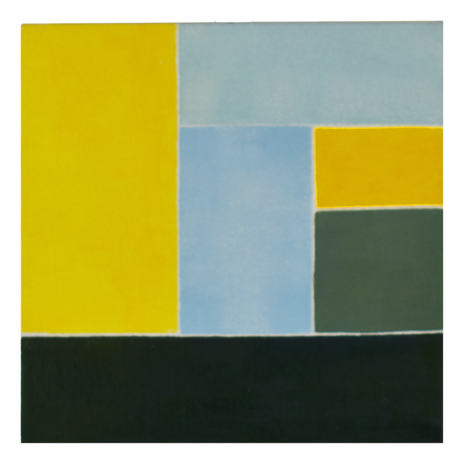
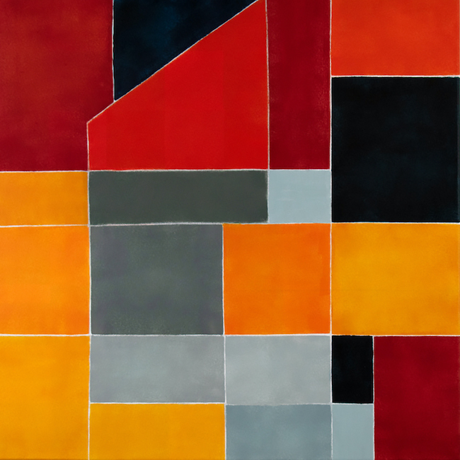
At the same time, what emerges from her canvases is the multifaceted nature of her artwork, the awareness of how each individual feeling is basically a chain, a stratification of previous experience that goes to build and construct the approach to life and events perceived in the present; it is that contiguous dialogue between different facets, between multiple sensations, that composes the mosaic of the complex personality of each individual, just as it is through synergy, the dialogue with the other, that one can deepen not only the knowledge of oneself but also that of one’s own capacity for interrelating.
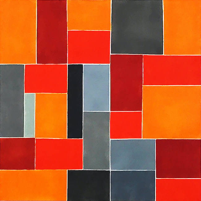
The artwork Red Simphony, Miss you, is the symbol of the wave of emotions that envelops the feeling of lack, that alternation of memories of pleasant moments and a sense of loss that the inner self is forced to deal with when faced with a separation from the person to whom it cannot help but feel bound. The tesserae in this canvas are irregular and the colours are multifaceted and different, underlining the number of emotions that come into play and envelop the memory, transforming it into nostalgia.
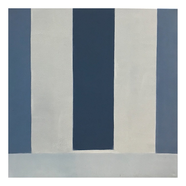
In Blue, Promise, on the other hand, the sensation is that of hearing an echo of suspended sentences; the rigour of those vertical stripes seems to underline the sadness of something unresolved, of a waiting that resembles disillusioned hope rather than the joyful expectation of something that will soon happen; in this case, the lack of intersection of the tiles implies solitude, the sense of disorientation generated by a departure preceded by the promise of a return that, in fact, never took place.
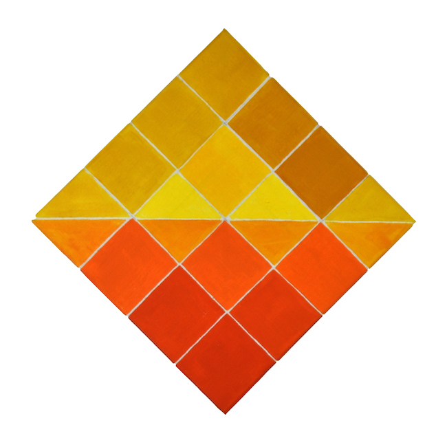
The canvas Summer, Balance seems to be a celebration of happiness, positivity, the joy of living in acceleration, in a balance between vivacity and passion, between naivety and maturity, between the spontaneity of feelings and the awareness that it is sometimes better to hold them back so as not to be overwhelmed by them; the communicativeness of the different shades of yellows and oranges envelops the observer, without the need to have in front of him images that adhere to reality but simply feeling attracted by the emotions that the vibrations of the colours involve. This is the main characteristic of Kleopatra Moursela, that of combining chromatism with the concept that speaks directly to the interiority of the observer, excluding the intermediation of the known image, rather, attracting him with the simplicity and rigour of the geometric shapes, of the tesserae, and then taking him inside the message that she wishes to communicate. Kleopatra Moursela is a university assistant at the Academy of Fine Arts, she is represented by Gallery 7 in Athens and during her artistic career she has had six solo exhibitions and several international group exhibitions.
KLEOPATRA MOURSELA-CONTACTS
Email: moursela_kleo@yahoo.gr
Website: https://artcyto.com/projects/kleopatra-moursela/
Facebook: https://www.facebook.com/kleopatra.moursela/


